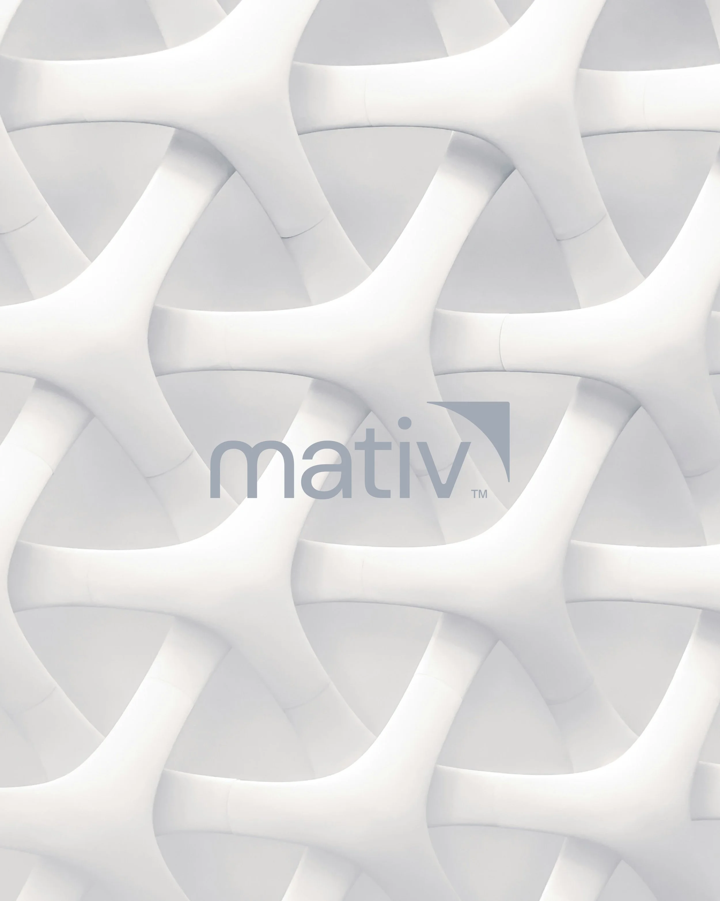
Formed through the merger of Neenah Inc. and SWM, a new parent brand was created to unify two legacy organizations while preserving the strength and equity of their individual portfolios.
Centered on the idea of formation, the identity reflects materials coming together to unlock new possibilities. A wing inspired symbol anchors the system, representing momentum and precision while creating a connective structure for an endorsed family of brands.
Bold colour, disciplined geometry, and a flexible design system balance engineering with expression. This visual language brings coherence to complexity, positioning the brand as a modern materials leader shaping what is next.
A new parent brand created to unify three legacy organizations under a single, modern identity. As Creative Director, I led the design work in collaboration with a multidisciplinary team, translating brand strategy into a clear and cohesive visual system.
The identity brings focus to the idea of life in motion. An organic wordmark and continuous line treatment express progress, confidence, and individual journeys, supported by a flexible design language built to scale across consumer facing touchpoints.
The result is a brand expression that balances heritage with optimism, bringing clarity and humanity to a complex category while reinforcing trust and relevance in everyday life.
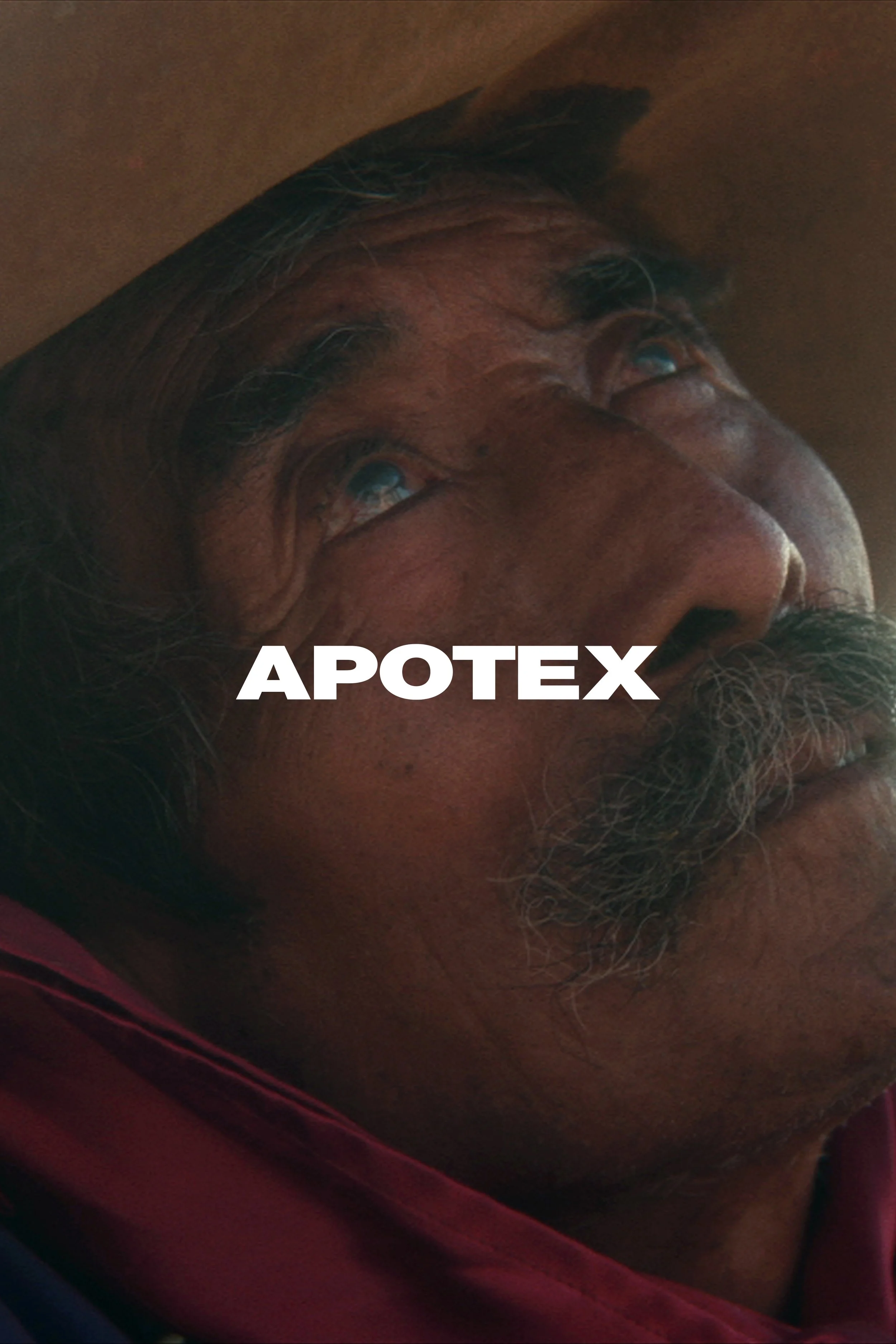
One of Canada’s leading pharmaceutical companies, committed to making quality healthcare accessible to all. To bring this purpose to life, a master brand film and a series of vignettes were created in collaboration with director Michael Del Monte, capturing real stories of strength and resilience.
Inspired by the mantra “A Force for Health,” the work extends beyond storytelling by evolving the brand’s visual language through a design system that embodies strength, care, and accessibility. This expression came to life across the brand, reinforcing its commitment to better health for everyone.
An award winning boutique studio based in Toronto and the Niagara Region, specializing in custom residential and commercial design. Grounded in the belief that structure shapes experience, the identity distills this idea into a mark defined by clarity and proportion.
The visual system reflects an architectural sensibility in both form and spirit, expressing an approach to design that is thoughtful, precise, and human at scale.
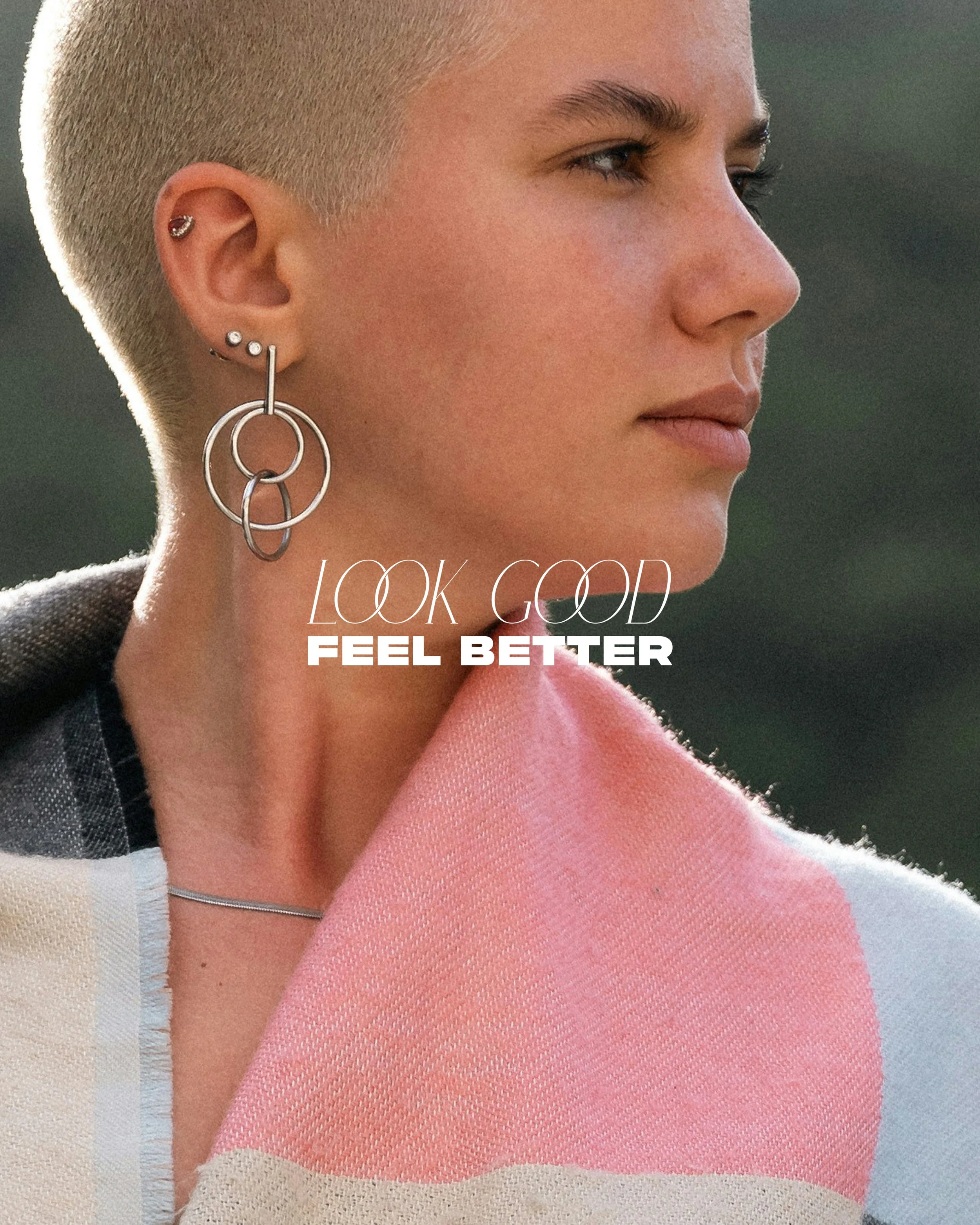
A program dedicated to supporting women as they navigate the emotional impact of cancer treatment through confidence, care, and community. A new brand identity was developed to reflect the strength, optimism, and resilience at the heart of the organization.
The logo and visual system emphasize clarity, warmth, and dignity, creating a cohesive framework that communicates support and empowerment across touchpoints. The result is a considered identity that reinforces the program’s mission while celebrating renewal and self-confidence.
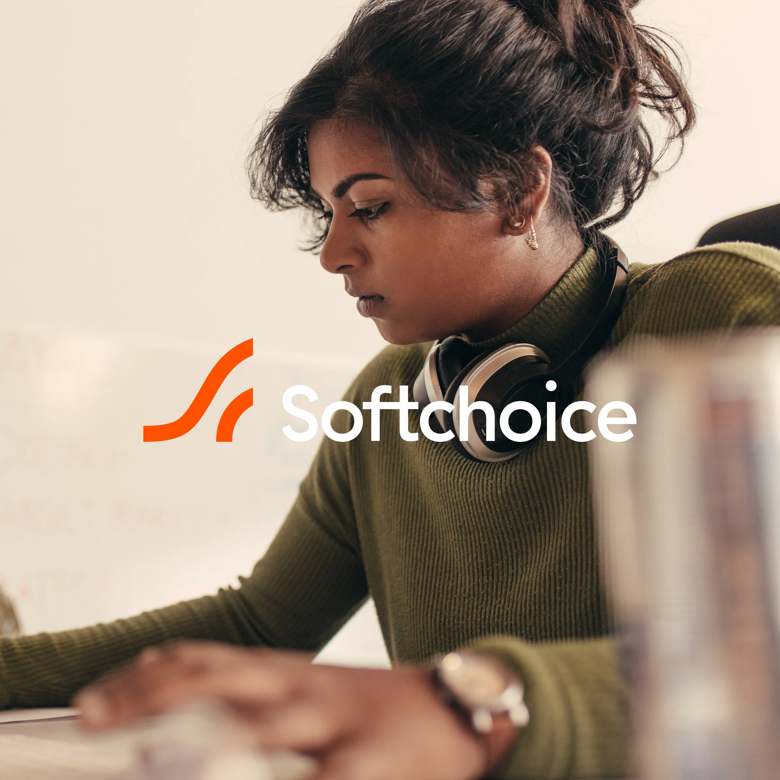
A rebrand created to bring clarity and warmth to a complex technology category. The work reframes enterprise IT through a more human lens, positioning Softchoice as a partner focused on collective success and long-term relationships.
The identity balances technical confidence with approachability. A wave inspired symbol conveys momentum and progress, supported by a flexible visual language that combines vibrant colour, considered typography, and expressive motion.
The result is a modern brand system that humanizes technology, bringing cohesion and optimism to how Softchoice shows up across consumer and business touchpoints.
Built on the principles of human centered luxury, a bespoke end of lease direct mail experience was created to reflect the customer’s personal relationship with design and craftsmanship.
The package translates a refined design language into a tactile and intuitive format, emphasizing materiality, precision, and care. Every detail was designed to feel considered and elevated, reinforcing a commitment to continuity of experience while encouraging customers to continue their journey with the brand.
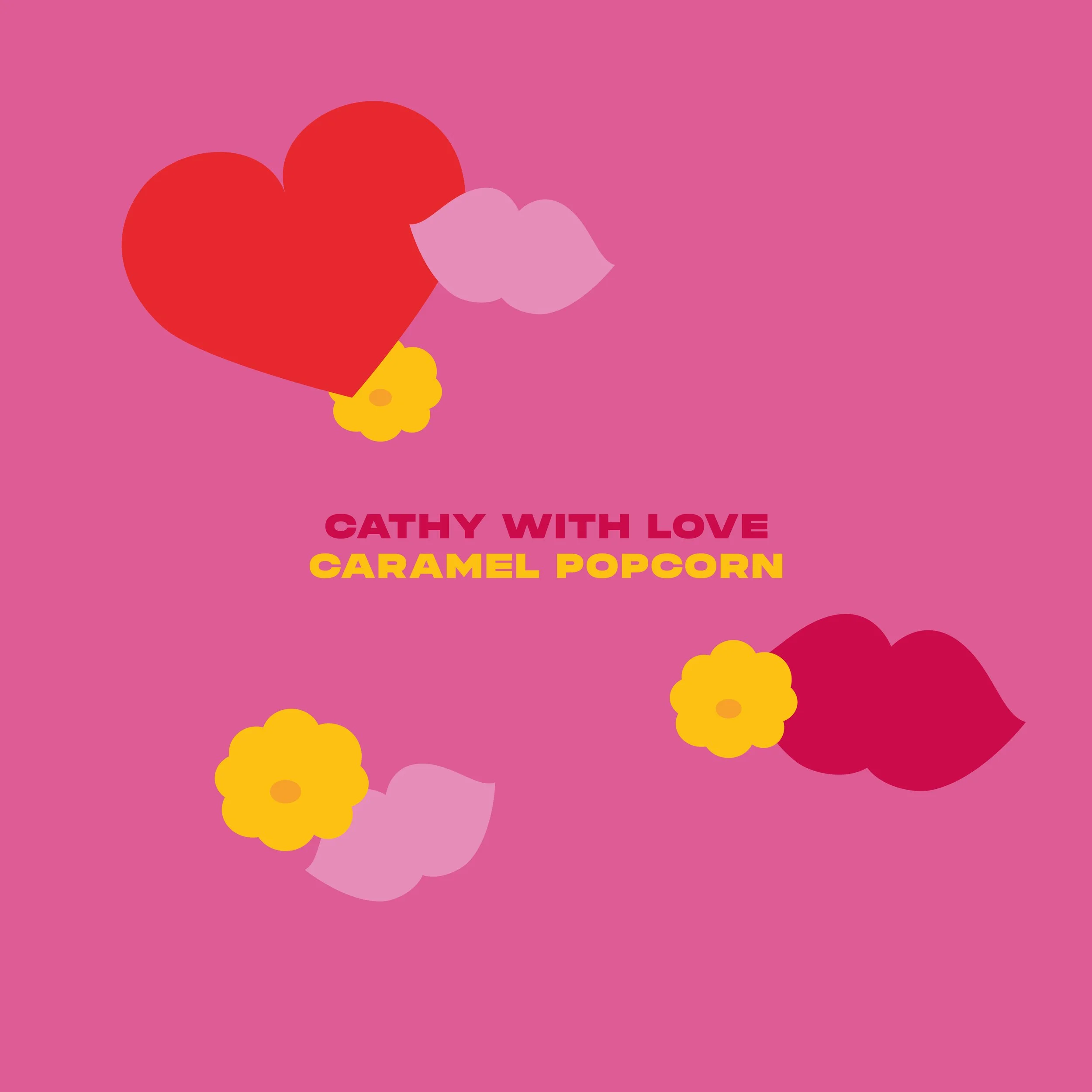
A small batch caramel popcorn brand rooted in warmth, personality, and handcrafted care. A bright and expressive packaging system was created to reflect the spirited character behind the brand and elevate its presence across holiday gifting and specialty retail.
Bold colour, playful typography, and simple graphic gestures bring a sense of joy and approachability to the experience. The result is a packaging design that feels personal, memorable, and reflective of the brand’s handmade charm.
An independent foundation dedicated to eliminating cheating in sport by supporting confidential sources who expose doping and by promoting transparency and integrity across global athletics.
A restrained visual system was developed to communicate these values through clarity, balance, and accessibility. Built on strong typography, disciplined composition, and a focused photographic approach, the identity extends across a mobile-first digital platform and global summit communications. The result is a cohesive brand presence that conveys trust, credibility, and a shared commitment to clean sport.
Introduced as the brand’s first credit card, the design reflects a transparent and customer focused approach to banking. The concept reveals the internal mechanics of the product through a layered, clear construction that visually communicates openness and clarity.
Transparent materials paired with the brand’s signature graphic language create a distinctive and modern expression. The result is a credit card design that reinforces a commitment to simplicity, innovation, and trust.
A comprehensive rebrand transformed the former Canadian Cosmetic, Toiletry and Fragrance Association into Cosmetics Alliance Canada, establishing a modern platform that reflects the scale and evolution of the beauty and personal care industry.
The process included collaborative naming, strategic positioning, and the development of a refined visual system designed to unify members under a clearer, more contemporary identity. A confident editorial aesthetic, restrained palette, and interconnected symbol express collaboration and category breadth.
The result is a cohesive brand that extends seamlessly across digital and industry communications, reinforcing CAC’s role as Canada’s authoritative voice for personal care.
Relaunched with a renewed focus on the evolving food landscape, the CRAVE MORE platform positioned the brand as a confident challenger, encouraging consumers to expect more from everyday food.
As Design Director and designer, I led the development of a cohesive visual system to unify campaign and brand communications. From custom typography and colour systems to disciplined layouts and image principles, the system established a distinctive language adaptable across transit, retail, digital, and brand standards.
The result is a scalable framework that brought clarity and consistency to a broad range of touchpoints, reinforcing the brand’s cultural relevance while elevating its presence in a competitive market.
Created to promote the Cassies, Canada’s advertising awards show recognizing proven business results, this video campaign plays on the insight that the awards clients value most are the ones tied to measurable impact.
Using humour and understated storytelling, the work reframes industry recognition through the client lens. The result reinforces the credibility of the Cassies while celebrating the role of effectiveness in great creative work.
A series of statements centered on effort, integrity, and intent. Simple truths such as “Work hard. Play nice.” and “Good, then glory.” form a visual language that celebrates the value of doing things the right way.
Through typography and composition, the work translates character into design, using clarity and restraint to reinforce the message. The series serves as a reminder that meaningful outcomes are built on thoughtful process and strong principles.
This collection of brand identities explores how clarity of focus and simplicity of type and symbol design define brand character. Each identity demonstrates how thoughtful reduction can create distinct, recognizable expressions.
Together, the work highlights the role of precision and restraint in shaping brands that communicate with confidence and purpose.
An award winning photographer whose work explores food and its surrounding culture. A book was designed to translate this visual storytelling into a cohesive editorial experience focused on the craft and character of beverages.
Vibrant colour pairings and layered image compositions highlight contrast between form and texture, bringing energy and depth to the narrative. The result is a publication that reflects both the artistry of the photography and the sensory richness of the subject matter.
In collaboration with Apple’s Instagram photographers, a series of large-scale office murals and posters were created to celebrate a distinctly Canadian perspective. Featuring athletes, musicians, cityscapes, and visual artists, each image was captured entirely on iPhone.
Installed as immersive interior environments, the work transforms everyday moments into powerful visual storytelling. The series reflects the diversity of Canada’s creative and cultural landscape while reinforcing Apple’s belief in accessible, expressive technology.
Created for Haft2, a branding and digital design agency built on the belief that colour strategy sits at the core of effective brand expression. The identity and design system position colour as a defining foundation that informs every aspect of the firm’s work.
Bold colour application, structured composition, and purposeful restraint reinforce this guiding philosophy. The result is a brand expression that demonstrates how colour shapes perception, meaning, and identity.
Located in Niagara on the Lake, the Outlet Collection at Niagara brings a refined retail experience to one of Canada’s most culturally rich destinations. The identity and design system were created to reflect the intersection of fashion, tourism, and local character.
Elegant typography, restrained composition, and contemporary visual cues establish a brand presence that feels sophisticated and understated. The result is a retail environment that balances premium fashion with the charm and distinct personality of the region.
Known for handcrafted instruments celebrated for their precision and artistry. A series of promotional materials was created to highlight the craftsmanship and individuality behind each guitar.
Provocative headlines paired with striking, minimal imagery place focus on form, detail, and character. The result is a visual expression that reflects a dedication to handmade quality and musical excellence.
A global corporate print campaign was created to raise awareness around critical diseases and highlight the company’s commitment to improving patient outcomes. The work communicates complex healthcare challenges through clear and accessible visual storytelling.
Striking imagery paired with restrained typography and thoughtful composition creates a confident and human centered expression. The result strengthens global brand presence while reinforcing the organization’s role in advancing patient care.
A refined brand book was developed to articulate Ink Entertainment and Icon Legacy’s shared vision for creating some of Canada’s premier dining destinations. Designed as an editorial experience, the piece communicates the partnership’s approach to uniting culinary excellence with immersive interior design.
Curated photography, disciplined typography, and a considered layout system create a tactile, atmospheric narrative that reflects the craft behind each restaurant concept. The result is a cohesive brand expression that positions the collaboration as a benchmark for hospitality shaped by design, culture, and storytelling.
A national awareness and fundraising initiative supporting individuals and communities affected by HIV and AIDS across Canada. A poster series was developed to reinforce the ongoing impact of the disease and encourage continued public engagement.
Using direct, emotionally grounded photography, the work communicates the realities of living with HIV and AIDS while maintaining a respectful and human perspective. The result strengthens awareness and supports the event’s mission to drive understanding, support, and action.